Introduction - headline max 70 characters
This component is only possible at the very top of a page. You can create it without asset or with image (4:3) or video (16:9). This text is plain text, therefore limited to 400 characters - more will be cut by the system.
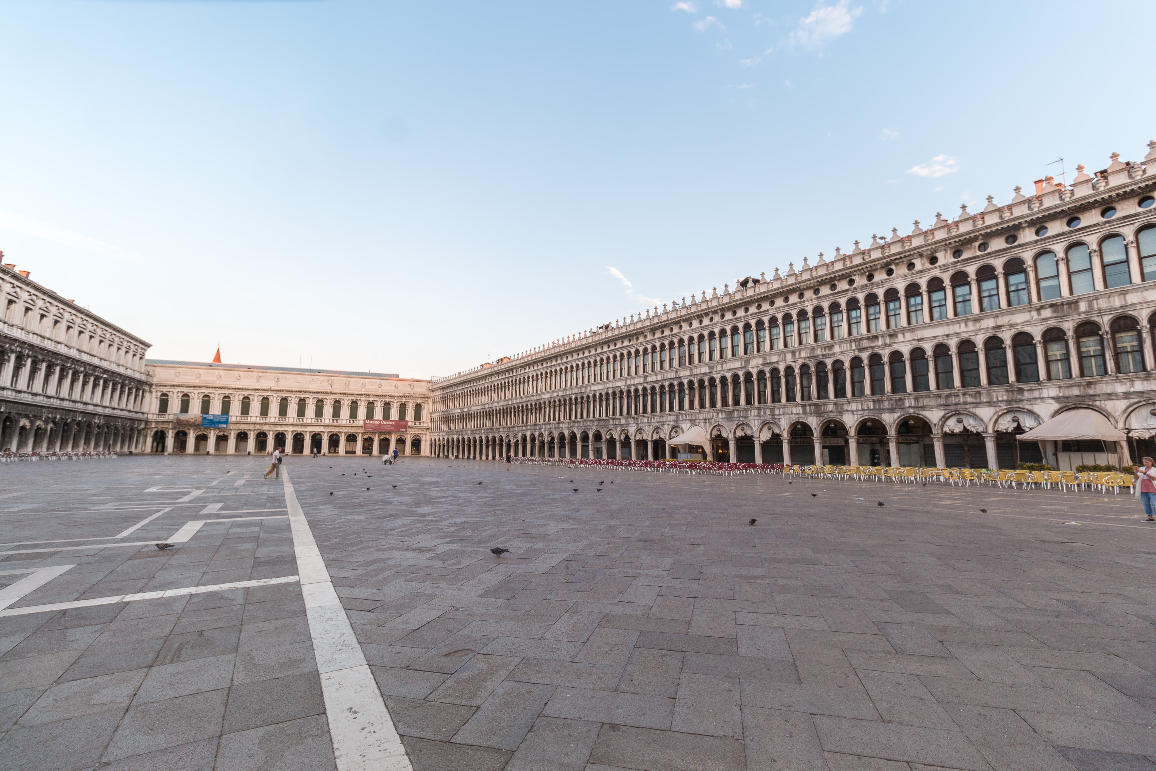
This component is only possible at the very top of a page. You can create it without asset or with image (4:3) or video (16:9). This text is plain text, therefore limited to 400 characters - more will be cut by the system.
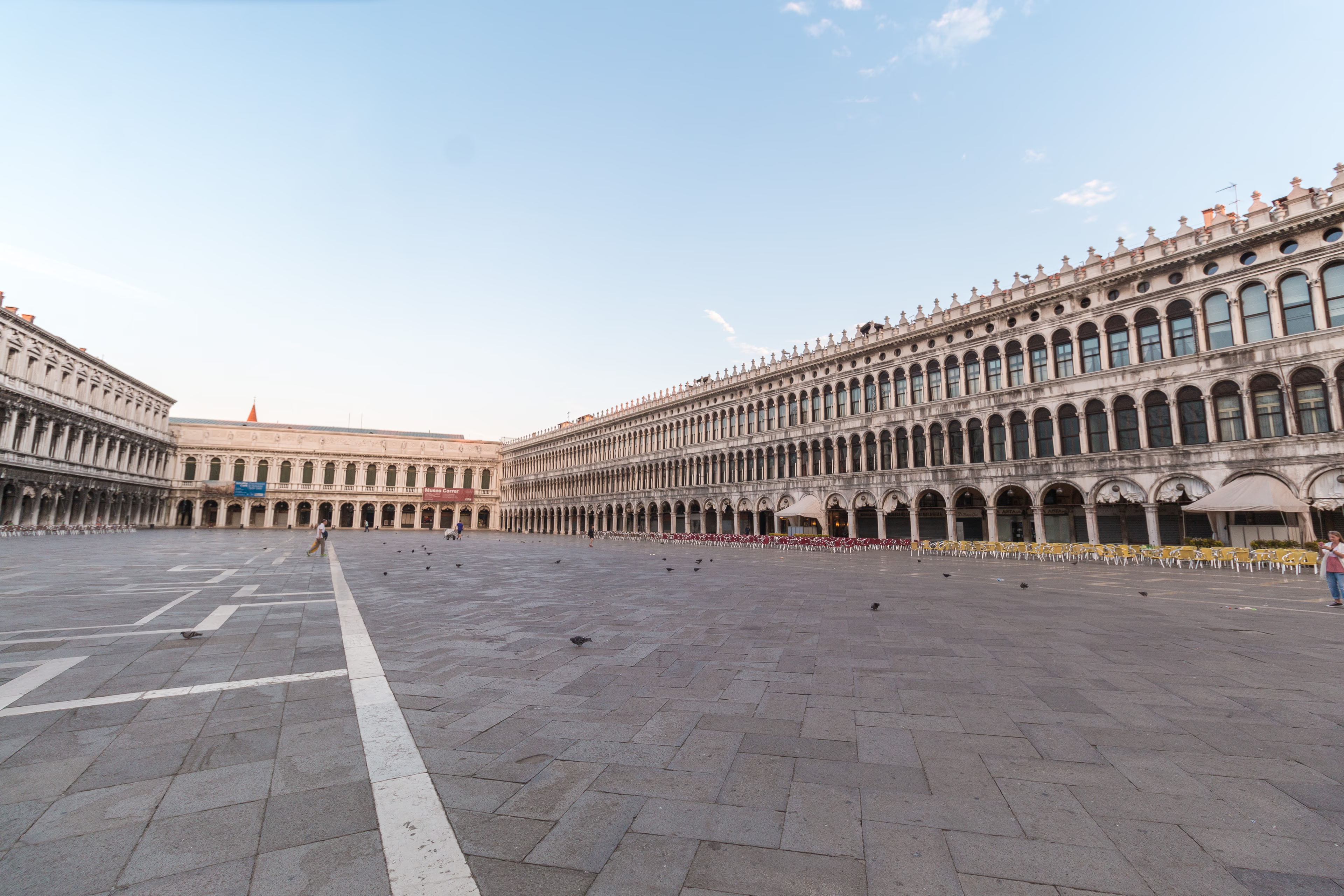
Story Introduction headline max 70 characters
Text area, max 400 characters allowed. The save the date functionality will not be available. The image gradient is needed for WCAG conformity and can not be switched off. Pls notice that you can use this component in all areas of a story or home template.
Chapter Introduction
Headline component above Media Text
Media Text Component
The headline shouldn't have more than 150 characters, the copy please restrict to <600. Bonus: headline works as ancor link.
The author can define the asset position as left or right.
The assets can be images and/or videos, image format is 4:3, videos can stay in 16:9.
If you need portrait image: it won't be cropped by the system, only the width is given. With portrait no slider possible.
At the component's end you can choose between Ghost button (today w/o border/color) or link list.
Headline component above Content Teaser Row

Content Teaser Row
One to four teaser per row allowed. The text is richt text and at the end there is the possibility of a link or a link list.
- Component's details
- Link list available

With video
One to four teaser per row allowed. The text is rich text and at the end there is the possibility of a link or a link list.
Headline
This teaser links to a detailed explanation of the headline component.
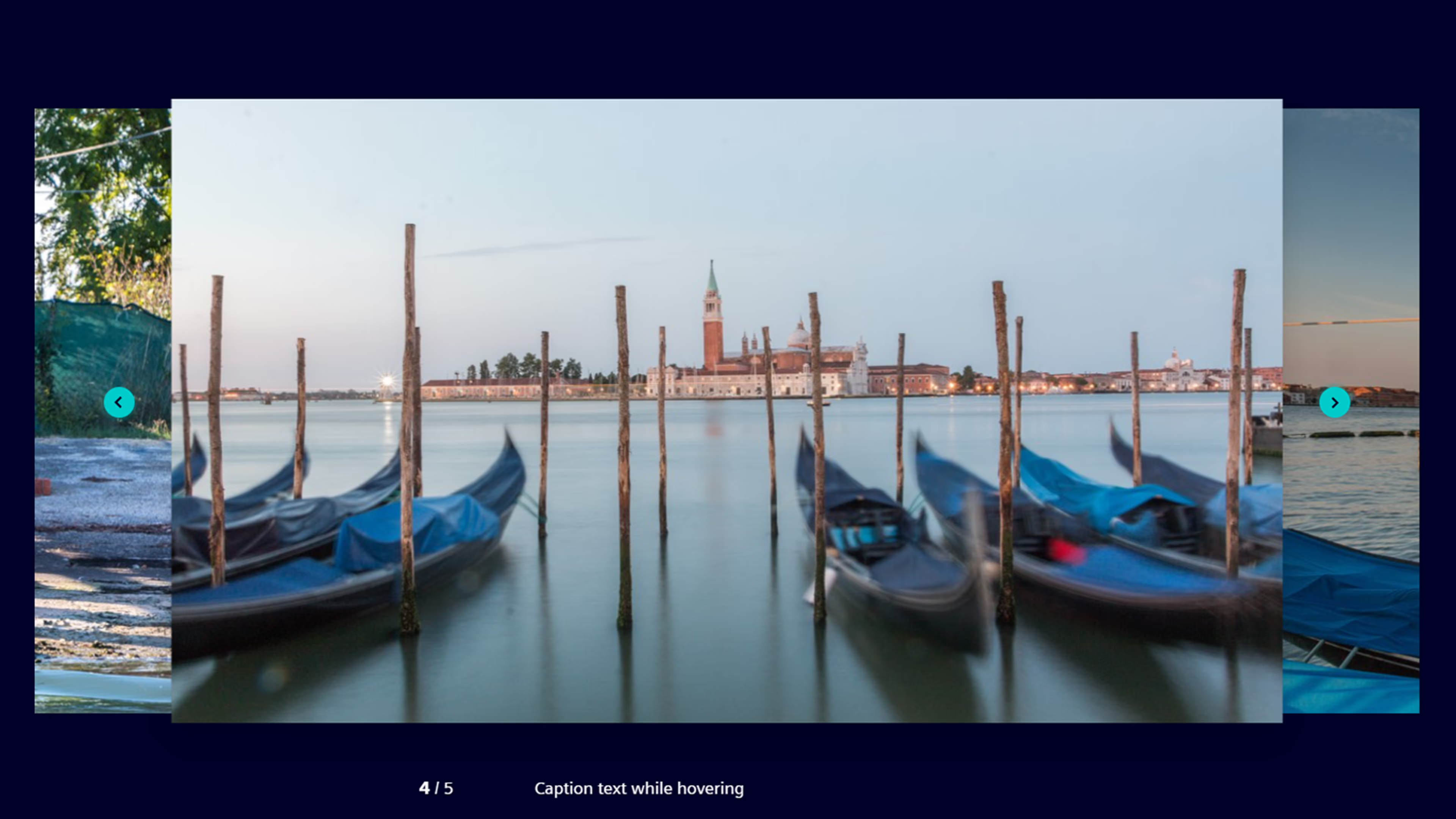
Multimedia Slider
The Image/Media Gallery and the Multimedia Slider result in the same component.
- Image/Media Gallery
- Multimedia Slider




Headline component above Quote component
This is a quote component. That's the truth, I swear with unlimited characters.
Shoutbox Component
This is the good, old shoutbox with all the functionalities you know. This text here is rich text, formatting possible.
The image left hand is also optional and has a fixed ratio of 4:3
Headline component above Rich Text component
This is the Rich Text component.
Rich text means that you can format this text slightly - bold, italic, create text links, etc.
The text length is unlimited.
Attention: to avoid big spaces between paragraphs you can use Shift+Return to create an carriage return instead of a new paragraph.
Follow this link to see more from this component and the automatic created link icons.
Headline above List of links with description ("Linklist")
- Details of the linklist component
Thats an intern target, above.
- External link without explanation text
Headline component above Image and Media Gallery
Headline component above Multimedia Slider
Headline component above Tab
Media Text Component
The headline shouldn't have more than 150 characters, the copy please restrict to <600. Bonus: headline works as ancor link.
The asset position is random but will be maintainable by author very soon.
The assets can be images and/or videos, image format is 4:3, videos can stay in 16:9.
If you need portrait image: it won't be cropped by the system, only the width is given.
At the very end you can choose between Ghost button (today w/o border/color) or link list.

Head of a content teaser
Copy of the content teaser
- Link text
Head of a content teaser
Copy of the content teaser
- Link text
Head of a content teaser
Copy of the content teaser
- Link text


Headline component above Accordion
Headline component above Teaser Box
Teaser Box
This is the Teaser Box component.
The optional image is 16:9, this text here is rich text.
- Here one link is possible.

Teaser Box, 2 with image
The image format will change to 16:9
Teaser Box 2, w/o image
This again is rich text which you're able to format a little bit.
Teaser Box, 3 w/o image
If you choose this variant, there isn't an image possible. Only rich text in three columns if it's a big screen.
Teaser Box, 3 w/o image
If you choose this variant, there isn't an image possible. Only rich text in three columns if it's a big screen.
Teaser Box, 3 w/o image
If you choose this variant, there isn't an image possible. Only rich text in three columns if it's a big screen.
Headline above DSS Tab component
Some links for Column 1
- An external link
- An internal link
- Link to a PDF
- Send a mail
Some links for Column 2
- An external link
- An internal link
- Link to a PDF
- Send a mail
Some links for Column 3
- An external link
- An internal link
- Link to a PDF
- Send a mail
- Mr. Suporter's phone
Informational Text under - +491000000000
Example phone, don't call this
- Mr. Suporter's phone
- Fax number
Informational Text
- Fax number
- Name
Company name
Street 1
Street 2
The best City
12345
Awesome State
Huge Country
- An external link
- An internal link
- Link to a PDF
- Send a mail
- An external link
- An internal link
- Link to a PDF
- Send a mail
- An external link
- An internal link
- Link to a PDF
- Send a mail

Headline of a Single Teaser Box
This is a Rich Text.
Headline, Rich Text, Image and Link are optional.
The image is in 16:9 ratio.
- One Link is possible
Headline of a Single Teaser Box w/o an image
This is a Rich Text.
Headline of 2 Teaser Boxes in one row
This is a Rich Text.
Headline, Rich Text, Image and Link are optional.
The image is in 16:9 ratio.
- One Link is possible
Headline of 2 Teaser Boxes in one row
This is a Rich Text.
Headline of 2 Teaser Boxes in one row, w/o image
This is a Rich Text.
- One Link is possible
Headline of 2 Teaser Boxes in one row, w/o image
This is a Rich Text.
Headline of 3 Teaser Boxes in one Row, w/o image
If you choose this variant, there is NO image possible. Only rich text in three columns, if it's a big screen.
A Headline, Rich Text and a Link are optional.
- One Link is possible
Headline of 3 Teaser Boxes in one Row, w/o image
The Rich text can be long:
Lorem ipsum dolor sit amet, consectetur adipisici elit, sed eiusmod tempor incidunt ut labore et dolore magna aliqua. Ut enim ad minim veniam, quis nostrud exercitation ullamco laboris nisi ut aliquid ex ea commodi consequat. Quis aute iure reprehenderit in voluptate velit esse cillum dolore eu fugiat nulla pariatur. Excepteur sint obcaecat cupiditat non proident, sunt in culpa qui officia deserunt mollit anim id est laborum.
Headline of 3 Teaser Boxes in one Row, w/o image
And even longer:
Lorem ipsum dolor sit amet, consectetur adipisici elit, sed eiusmod tempor incidunt ut labore et dolore magna aliqua. Ut enim ad minim veniam, quis nostrud exercitation ullamco laboris nisi ut aliquid ex ea commodi consequat. Quis aute iure reprehenderit in voluptate velit esse cillum dolore eu fugiat nulla pariatur. Excepteur sint obcaecat cupiditat non proident, sunt in culpa qui officia deserunt mollit anim id est laborum.
Lorem ipsum dolor sit amet, consectetur adipisici elit, sed eiusmod tempor incidunt ut labore et dolore magna aliqua. Ut enim ad minim veniam, quis nostrud exercitation ullamco laboris nisi ut aliquid ex ea commodi consequat. Quis aute iure reprehenderit in voluptate velit esse cillum dolore eu fugiat nulla pariatur. Excepteur sint obcaecat cupiditat non proident, sunt in culpa qui officia deserunt mollit anim id est laborum.