Visualizing mass transit railway data
A smoothly running mass transit railway network is the backbone for clean, livable cities, providing save and sustainable travel opportunities. Our System Performance Dashboard for mass transit systems provides operators with centralized insights on their infrastructure – for better network utilization, improved punctuality, condition-based maintenance and optimal capacity handling.
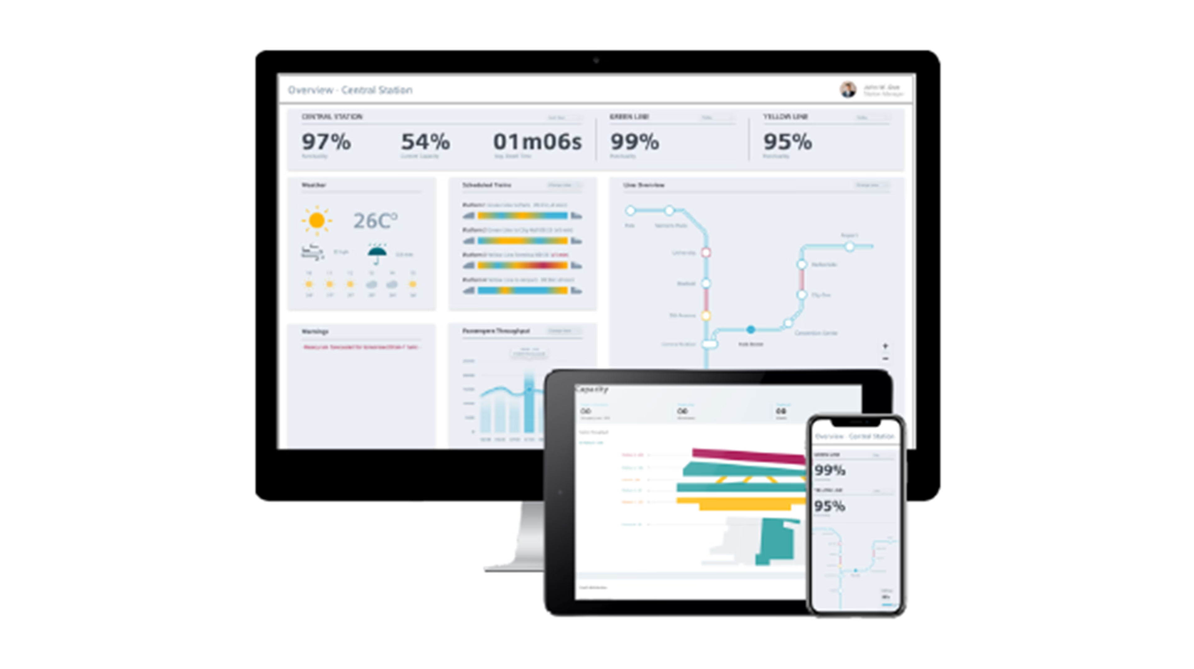
A smoothly running mass transit railway network is the backbone for clean, livable cities, providing save and sustainable travel opportunities. Our System Performance Dashboard for mass transit systems provides operators with centralized insights on their infrastructure – for better network utilization, improved punctuality, condition-based maintenance and optimal capacity handling.
Maintaining an overview in the data jungle
All-in solution for different mass transit functions

Line operator
- Overview of data insights based on customized KPIs such as energy consumption, line punctuality, and delays as well as line capacity on trains and platforms

System maintainer
- Combining data from signaling and radio systems to monitor health of assets, incl. radio, interlockings, CBTC, ATS, wayside equipment, and point monitoring

Station operator
- Monitoring station assets (SCADA, CCTV, air conditioning)
- Optimizing the flow of the station with crowd simulation and capacity solutions
Discover what the dashboard can show you
Dashboard for signaling system KPIs and insights
How punctual are the trains on your line? And are there any abnormal deviations of dwell times or missed stopping points at your platforms? The System Performance Dashboard for mass transit systems provides mass transit operators with an overview of essential signaling system KPIs to monitor and optimize the line and platform punctuality.
Punctuality overview
- Punctuality rate, in %
- Missed stopping points, in %
- Number of emergency brakes, per line
- Heatmap: frequency of emergency brakes per station
- Number of emergency brakes per vacancy section
Platform punctuality
- Station and platform with the most missed stopping points
- Station and platform with the longest deviation
- Average arrival deviation in sec; avg. departure deviation in sec, avg. dwell deviation in sec
- Train with most missed stopping points
- Number of missed stopping points per platform
- Highest dwell deviation per platform
- Number of missed stopping point per train
Line punctuality
- Avg. punctuality, in %, per last week
- Interlocking with most emergency brakes (EB)
- The “reason” that resulted in the most EBs
- Train with most EBs
- Train with longest deviation
- Line plot: punctuality rate over time, filtered per line, per up/down-track direction
- Bar plot: cause of emergency brakes, “reasons"
- Bar plot: no. of emergency brakes per train, filtered per line, per up/down-track direction, per driving mode of train
- Correlation matrix: correlation of key performance indicators like overall punctuality, arrival punctuality, avg. deviation arrival, […]
- Density plot: distribution of deviated incidents, filtered per up/down-track direction
Dashboard for radio performance KPIs
Constant monitoring the radio system performance is key to transmit operational services such as real-time CCTV transmission as well as passenger services like on-board PIS, passenger WiFi, and online advertising securely and reliably. The System Performance Dashboard for mass transit systems gives operators a clear and fast overview of the radio signal strength at different locations, on individual trains, and at different times. Operators can also comfortably check KPIs like alerts, alarms, outages, coverage performance, and equipment availability.
Radio overview
- Train availability, in %
- Wayside availability, in %
- Coverage performance status: “good” by > 95%
- Radio system, in %
- Overview over alerts that occurred in the last time, per train/access point
- Current status of trains: visualized train-line-map with all trains in use, problems within the train-line and exact location
- Highest outage trains, in hours
- Highest outage access point
Train – summary
- Train availability, in %
- Alarm count, last 7 days
- Radio system, in %
- Overview over “fault” trains in the last days, issues like “lost connection”
- Highest outage trains, in hours
- Avg. signal strength from all access points with trains
Train – detail
- Equipment availability, in %
- Service availability, in %
- Average signal strength, in dB, last 30 min
- Overview over alerts, last days
- Specific train outage over time, last weeks
- Specific train alarm count over time, last weeks
- Signal strength of radio cards, signal strength by time and location
Wayside equipment – summary
- Train availability, in %
- Alarm count, last 7 days
- Radio system, in %
- Coverage performance, in %
- Average signal strength over chainage position, in dB
- Overview over alerts that occurred in the last time per access point
Wayside equipment – detail
- Equipment availability, in %
- Alarm count, last 7 days
- Table of general information per access point (“Raw IP”, […])
- Overview over alerts that occurred in the last time per access point
- Segment outage over the last days
Dashboard for Controlguide AIRO MT, our demand-responsive transport solution
Precisely adjusting train services to the actual demand enables savings in trains, train kilometers, and energy consumption, as well as shorter waiting times. Our demand-responsive transport solution Controlguide AIRO MT offers an optimized approach to preparing timetables and scheduling trains based on actual passenger demand. The System Performance Dashboard provides mass transit operators with key insights into the predicted and the actual passenger demand, its comparison for the current day, the prediction quality for past days, and the train schedule developed by AIRO MT including the predicted passenger demand.
Demand-responsive transport – overview
- Overview of predicted passenger numbers for current day and for several days in the future
- Comparison of predicted passenger numbers and actual passenger numbers for current day
- Overview of prediction quality as a comparison of the predicted and actual passenger numbers for past days
- Overview of train schedule developed by AIRO MT and the predicted passenger demand
Demand-responsive transport – detail
- Forecasted number of passengers per segment of the line and per time for the day selected
- Actual number of passengers per segment of the line and per time for the current day
- Summary of the deviations from the predicted demand to the actual passenger numbers for the actual day
- Summary of the deviations from the predicted demand to the actual passenger numbers for days in the past
- Comparison of train schedule developed by AIRO MT and standard train schedule for the day
Dashboard for station asset performance KPIs
To keep an eye on all technical assets of a station can be a handful. To simplify the task and to ensure a smooth station operation, the System Performance Dashboard provides mass transit operators and maintainers with a clear visualization of the station asset performance data, provided by the Digital Station Manager. This makes it easier and faster to check and localize conditions and alarms of assets such as elevators and escalators, climate control, lights, platform displays, speakers, surveillance cameras, access controls, signaling components and many more.

Station equipment overview
- Working equipment, in %, of the selected station
- Number of station equipment alerts on concourse or platform level
- The “Alerts” feature displays the last alerts issued by the station equipment
- The number of current unsolved alerts is shown
- Number of failures that have happened as a function of time
- Distribution of assets (in 2D/3D maps) including color coded health status of each asset
Dashboard for the capacity solution
How many passengers are using the different platform? How’s the station capacity? And how’s the train capacity? The System Performance Dashboard has the answer. It supports mass transit operators to manage crowds and to comply with social distancing by visualizing data that are collected and analyzed by the Siemens Digital Station Capacity Solution. This way, operators can comfortably keep an eye on all KPIs linked to social distancing to avoid overcrowding on platforms and trains.
Capacity overview
- No. of overcrowded stations
- No. of emergency alerts
- Average occupancy over all stations, in %
- Average occupancy over all trains, in %
- Network overview of the whole mass transit system for the selected city
- Overview over all general alerts in the last days per station and platform
- Station capacity summary, filtered per station and platform, “normal”/”overcrowded” […]
Capacity station
- No. of people in the station and occupancy rate, in %
- No. of people entered/left in last 5 min
- No. of actual boarding trains
- 3D capacity heatmap: all platforms and floors to show density of people
- Coach distribution: color coded to show density of people
- Daily occupancy forecast per station with “actual” and “forecast”
- Weekly occupancy forecast per station with “actual” and “forecast”
Capacity platform
- No. of people arriving/leaving by train, in last 2 min
- No. of people not wearing a mask
- Station map: the layout of the platform and the live location of every single person being on the platform, a warning can pop up, if the density of people is very high in a certain area
Capacity analytics
- Occupancy anomaly detection: actual data; a dynamic forecast based on different data sources like weather forecast, static forecast based on static data like weekdays
- Access flow, separated by entrance
- Occupancy per station, separated by concourse, platform, “Middle Floor”, […]
- Entrance/exit analysis, amount of people entering or leaving the whole station
- Alert types (“42% overcrowded”, […])
- Alert types over time
Utilize your data for optimized mass transit railway operation
Secure connectivity and intelligent data analytics
To get the most out of your dashboard, relevant rail network data must be recorded, securely transmitted, stored, processed, and analyzed. We extract data from your subsystems, including interlockings, point machines, balises, signaling systems, axle counters etc. in the most secure way by using the Siemens Data Capture Unit (DCU), embedded in the MindConnect Rail hardware and software solution.
To turn these data into unparalleled insights, highly precise predictions, and valuable decision support, our data analytics solutions combines state-of-the-art analytical methods like artificial intelligence and machine learning with signaling knowledge for effective data aggregation, processing, and analysis.
The preprocessed data stored in the cloud can then be accessed with the cloud-based System Performance Dashboard.
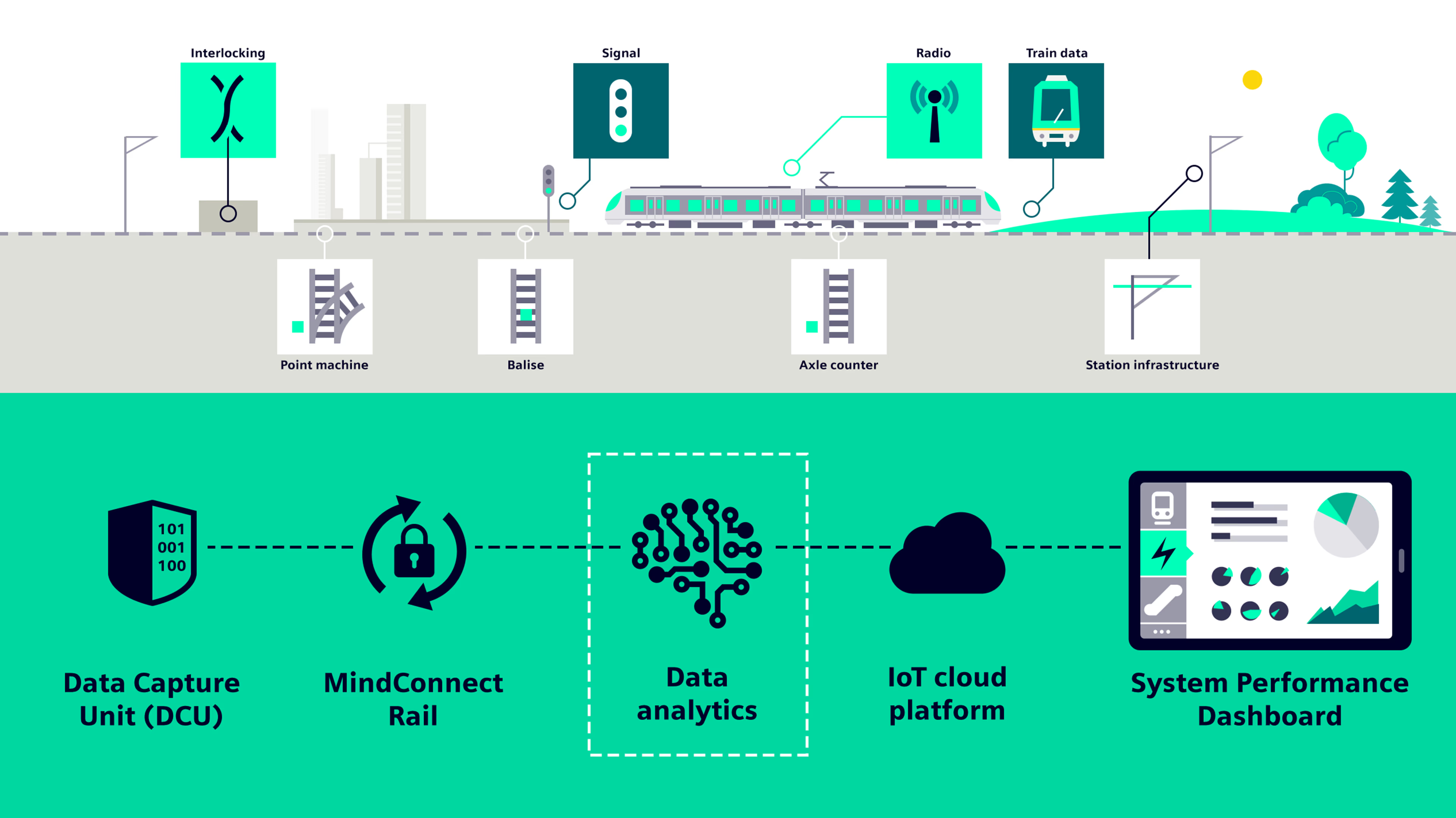
Examples of how the data analysis for the dashboard works
Helpful insights for mass transit operators in smart cities
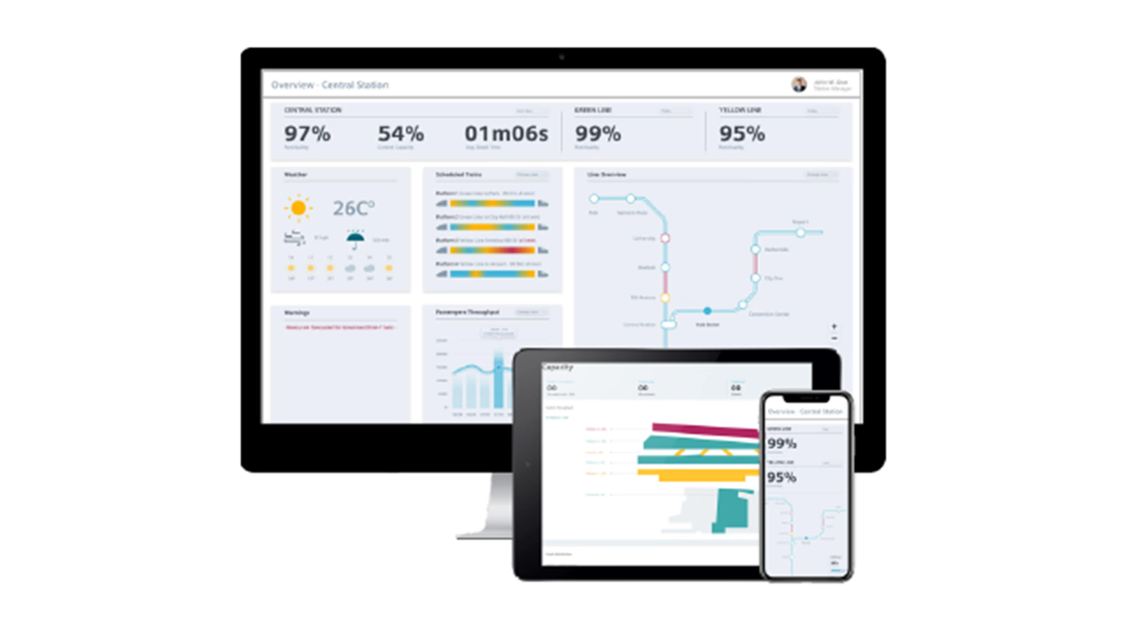
The user-friendly System Performance Dashboard provides live and remote monitoring of the connected railway infrastructure: It visualizes data collected from stations and signaling systems in real time. This allows operators to monitor important KPIs such as throughput, punctuality, energy consumption, and asset availability. The innovative data representation and visualization, asset information and management, performance monitoring, and predictive insights support mass transit operators to make better decision for improved operations, reducing maintenance and operational efforts.
The System Performance Dashboard runs on an IoT cloud platform and can be used with any web browser device. It can also be role-specific customized, e.g., for line operators, maintainers, or station operators.
Innovative data insights with added value
Discover the benefits that our dashboard can offer you:
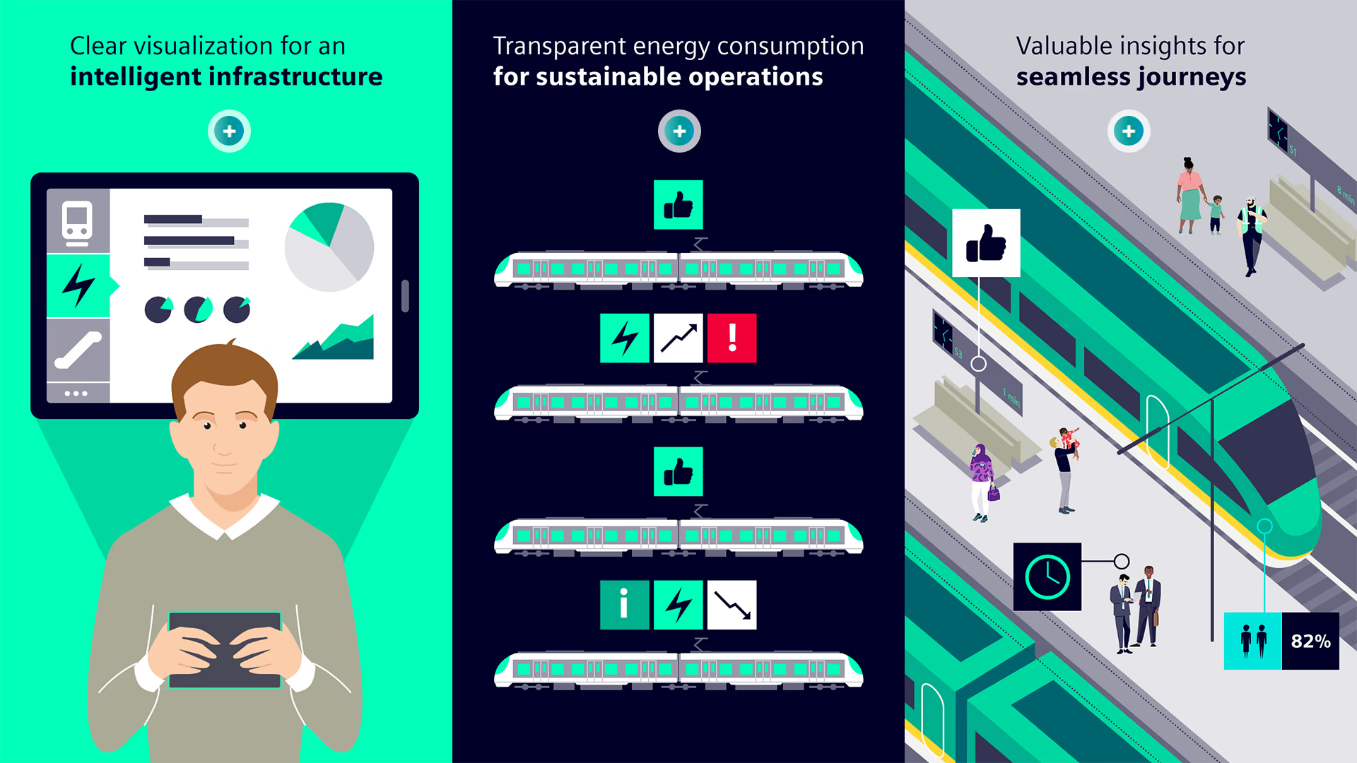
Optimized performance
The monitoring of customized KPIs makes it easier for operators to maintain and enhance the system and operational performance.

Increased energy savings
The transparency on the energy consumption helps line operators and managers to reduce the overall energy usage and to avoid energy penalties.

Enhanced maintenance
The asset monitoring and prescriptive maintenance increases the asset lifecycle. And thanks to the data-based improved planning, the maintenance execution gets more efficient.

Efficient work routine
The automatic reporting via the smart dashboard decreases the daily operational workload significantly.